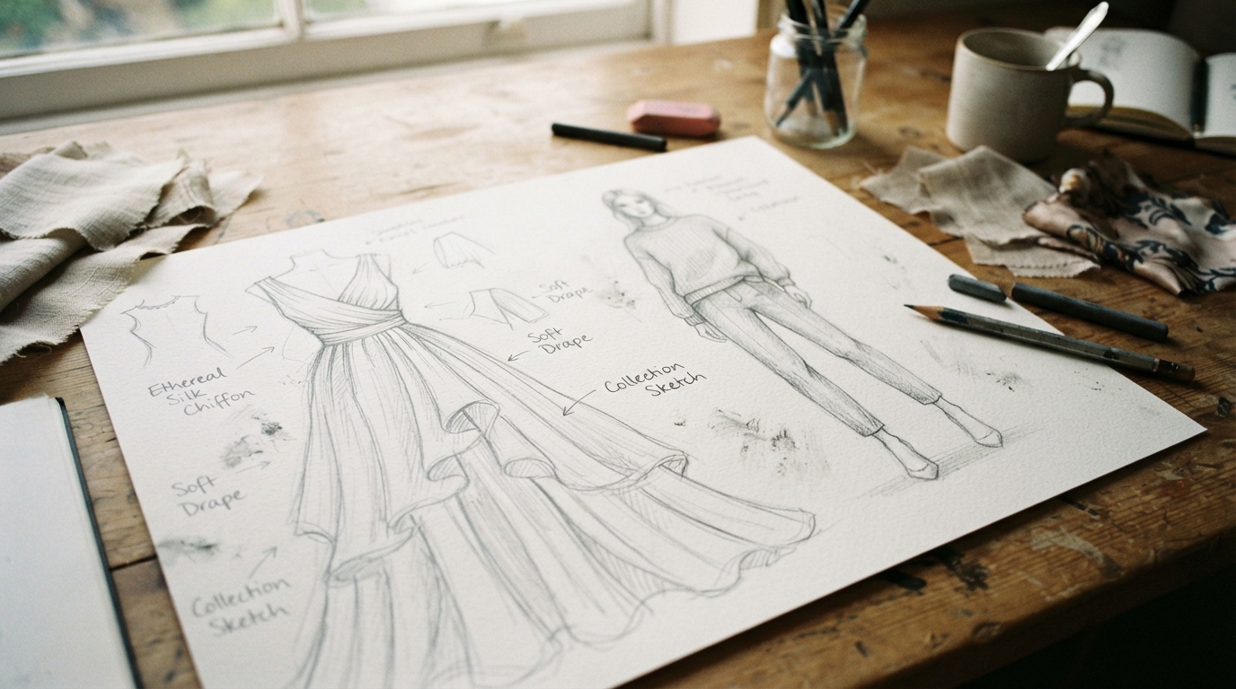
We can turn a clothing idea into a readable sketch by building it in small, manageable stages. These fashion illustration techniques give beginners a clear way to get started without needing expert drawing skills. We will move from simple figure construction toward poses, garments, fabric, color and a finished personal style.
Basic supplies and regular practice are enough to begin. We can learn one part at a time, then use each new skill to make our design easier to understand. A simple pencil, paper and one design idea are enough for our first practice session.
Key Takeaways
- Start with light guides and simple figure shapes.
- Choose proportions that suit the garment and its audience.
- Draw the garment’s main silhouette before adding details.
- Use fabric folds, texture and color with a clear purpose.
- Review the sketch at page size before calling it finished.
What Does a Fashion Illustration Show?
Fashion illustration communicates a design, mood and clothing style through a drawing, not just a realistic body study. A croquis is an elongated figure template that gives us a base for drawing clothing designs. The garment leads, while the figure helps show how the design might look when worn.
A rough sketch captures an early idea, while a finished illustration can show silhouette, styling and fabric flow. A nine-head croquis is elongated compared with a realistic figure, which is about 7.5 heads tall. That stretch is a drawing choice, not a claim that one body type suits every design.
We can stylize a figure to make a garment’s shape easier to see without treating that figure as a fit standard.
Fashion illustration techniques build confidence when we work in simple stages instead of chasing polished detail first. We can change the figure’s shape, stance and proportions to suit the design goal and the audience. The sketch can focus on a long coat, a soft sleeve or the mood of a whole outfit.
Facial features can help set a mood, but they do not need to compete with the clothes. We can keep facial details minimal when the clothing and silhouette are the main message.
Which Supplies Help Us Start Sketching?
We can start with a pencil, paper and one coloring medium instead of buying a full set of supplies. A light graphite pencil lets us make guides we can change, while a fine liner can define selected edges. Start with what we have, then add tools as a project calls for them.
Choose paper for the medium, since markers and wet color can behave differently on thin sketch paper. An eraser cleans guides, colored pencils add controlled color, and markers cover broad areas quickly. Gouache and watercolor brushes suit painted color; round pointed watercolor brushes in sizes 8-10 plus a smaller brush offer broad and fine marks.
Choose pencils, pens and color media
A 2B mechanical pencil or soft graphite between 2B and 6B works for light construction lines. Ebony pencils are another soft graphite option. Micron pens come in sizes 12, 8 and 05, with archival, fast-drying ink for crisp linework.
Copic markers have refillable brush and chisel tips. Prismacolor markers have brush and pen tips and are not refillable, while Artist’s Loft markers have brush and chisel tips. None is the best choice for every person or drawing style.
Pelikan, Grumbacher, Caran d’Ache and Winsor & Newton make dry-pan gouache options. Prismacolor Premier and Faber-Castell are colored-pencil options. A refillable Sakura SumoGrip eraser and Sakura Gelly Roll Metallic pens can help with cleanup and small shiny details.
Match the paper to the medium
A spiral pad works for quick sketches, while finished illustrations often need a smoother or heavier surface. Marker paper is made for marker work. Mixed-media paper has thickness and surface texture, so it can suit more than one medium.
| Paper | Best use | Recommended size or format |
|---|---|---|
| Spiral sketch pad | Quick fashion sketches | At least 14 × 17 inches, landscape |
| Bristol vellum | Finished illustrations | 11 × 14 inches, vertical; 14 × 17 inches, horizontal |
| Watercolor paper | Finished watercolor illustrations | 11 × 14 inches, vertical; 14 × 17 inches, horizontal |
We can first try supplies already at home, such as notebook paper and colored pencils. Test a new marker or paint on scrap paper before committing it to a finished drawing.
How Do We Use Fashion Illustration Techniques to Build a Croquis?
We can build a balanced croquis by dividing a vertical guide into nine equal head-length units before adding body contours. For an easy fashion design drawing, we use light shapes and guides first, then refine the outline. Keep the marks light so the figure can change as we work.
Use the same head length for all nine units. This gives us a simple measuring tool for placing the main body landmarks. A ruler can help us keep the first guide straight, but freehand marks work for practice.
Mark out the nine head units
- Draw a vertical guide for the figure’s height.
- Divide the guide into nine equal head units.
- Sketch the head inside the top unit.
- Add horizontal guides and anatomy landmarks.
- Keep all construction marks light and easy to adjust.
Add guides and the basic skeleton
Draw the center line through the figure’s middle, following the body’s direction. On a front-facing croquis, this line helps us keep the torso and limbs organized. Add a simple skeleton with short marks for the shoulders, waist, hips, elbows, knees and ankles.
Set the shoulder line at roughly two head-widths across. Make the waist about one head-width, and draw the hips about as wide as the shoulders. These are starting relationships, not fixed rules for every body or garment.
Connect the landmarks with simple shapes before drawing a smooth outer contour. Use oval or block forms for the torso and pelvis, then add long shapes for the arms and legs. We can make the shoulders, waist or hips broader or narrower when the design calls for it.
Check that the center line remains visible enough to guide both sides of the figure. Keep the first pass pale enough that we can adjust a shoulder or hip without fighting a dark outline.
Which Figure Proportions Suit the Design?
Choose 7-8 heads for a more realistic fit view, 9 heads for an elongated fashion figure or 10 heads for an editorial stretch. The design sets the choice, since an expressive outfit sketch and a fit-focused drawing need different views. A realistic human figure is about 7.5 heads tall.
Nine-head proportions are a style tool, not a required body standard. They stretch the figure for fashion sketches, while 7-8 heads can make fit and garment shape easier to judge. Ten heads are often used for editorial illustration.
| System | Typical purpose | Proportion notes |
|---|---|---|
| 7-8 heads | More realistic fit visualization | Useful for technical flats and some petite, plus-size, children’s and athletic apparel designs |
| 9 heads | Elongated fashion illustration | Common stylized figure with landmarks through nine units |
| 10 heads | Editorial illustration | Uses a longer, more stretched figure |
https://www.youtube.com/watch?v=GhDUXeBvMMw
For a nine-head figure, place the shoulder line near head 1.5 and the bust apex near head 2. Set the waist at head 3, hips at head 4 and crotch at head 4.5. These points help us place a garment’s main areas.
Place the knee near head 6 and calf near head 7.5, with ground level at head 9. The nine-head measurement ends at ground level, not at the top of the shoes. Footwear changes the visible foot height, especially when a design uses heels.
Use proportions that serve the audience and garment, rather than forcing each design onto one figure type. Match the figure’s proportions to the garment and audience instead of forcing every design onto the same template.
How Do We Choose and Print a Fashion Sketch Body Template?
A useful US Letter template starts as a 300 DPI file and prints at 100% when consistent proportions matter. We can draw a croquis ourselves or use a printable to save time. Scale matters when we plan to reuse the same figure for several clothing designs.
On US Letter paper, a figure about 8-10 inches tall leaves room around the hands, feet and outer silhouette. A head unit can be roughly one inch tall on an 8.5 × 11-inch sheet, but the unit changes with paper size.
Choose “Actual Size” or 100% in the print settings, not “Fit to Page,” to preserve scale. A high-resolution PNG with a transparent background works for arranging and layering a figure. A page-ready PDF keeps a fixed print layout.
| Kit | Price | Included template or learning materials | Files |
|---|---|---|---|
| Basic Croquis Kit | $29 | 10 poses, interchangeable head, hand and foot templates, technical flat template, walking-pose e-book | 3 PDFs; Procreate stamp brushes; 8.5 × 11-inch pages print at any size |
| Standard Croquis Kit | $49 | 9-head templates, basic and dynamic poses, thumbnail templates, interchangeable head, hand and foot templates, technical flat, walking-pose e-book | 3 PDFs; Procreate stamp brushes; 8.5 × 11-inch pages print at any size |
| Premium Croquis Kit | $99 | 300+ templates, interchangeable head, hand and foot templates, technical flat, croquis e-book and workbook | 5 PDFs; Procreate stamp brushes; 8.5 × 11-inch pages print at any size |
A printable set can help when we need several views or learning materials. The Basic Croquis Kit includes 10 poses, while the Standard set adds thumbnail templates and basic and dynamic poses. The Premium set includes more than 300 templates.
Each kit uses 8.5 × 11-inch pages that can print at any size. A test print checks line darkness, proportions and scale before we use more sheets. Run one test page and check its scale and line visibility before printing a full set.
How Can We Draw Poses That Show Movement?
A figure feels more alive when its center line shows a shift of weight instead of a straight, stiff stance. Gesture drawing is a quick search for a pose’s direction, balance and center of gravity. Let the center line flow through the body rather than forcing both sides into a mirror image.
A walking model pose gives a skirt or coat room to show motion, while a standing view keeps construction easier to read. Start with one curved line for the torso’s main direction, then add simple shapes for the shoulders and hips.
Begin with gesture and balance
Use quick, loose marks to show which leg supports the figure and which one moves. Let the shoulders and hips tilt in response to that weight shift. Rigid mirrored arms and legs can make even a well-drawn figure look stiff.
Before adding clothing, check where the figure’s weight rests. A raised heel, bent knee or turned shoulder can suggest movement, but the supporting leg still needs to carry the body.
Choose a view that reveals the garment
- Back view: show back seams, closures and a garment’s rear shape.
- Three-quarter view: reveal front and side panels at once.
- Walking view: show how a skirt, coat or loose sleeve moves.
- Seated view: show how fabric gathers or stretches when the body bends.
These views answer different design questions, so no single pose works for every garment. A back view can clarify a closure, while a walking view can show fabric in motion. A seated pose may help us see where a long hem gathers around the legs.
Choose the view that makes the garment’s key feature easy to see. Check that the head, torso and supporting leg still balance before adding clothing.
How Do We Use Line Weight to Clarify a Sketch?
Three deliberate line weights can separate construction, contour and emphasis in a fashion sketch. Use light lines for guides, firmer marks for the silhouette and darker accents for selected details. Different pressure gives each line a job before we add color.
Start with three levels: light construction marks, medium contours and dark accents. A medium line can define the shoulder or outer sleeve, while a dark mark can show an overlap or shadow edge. A seam needs a clear line, but it does not need to overpower the garment outline.
Line weight can suggest emphasis and depth. Hatching uses repeated lines to build value, while cross-hatching layers lines in more than one direction. Both methods can darken a small area without filling it with a solid block.
Contour lines describe an edge or shape. Hatching can follow the curve of a sleeve, while cross-hatching can deepen a shadow beneath a fold. Keep the direction of the marks tied to the form they describe.
Try drawing one sleeve with three line weights. Then remove marks until its outer edge and fold direction still read clearly. If every edge is equally dark, erase or soften the least important marks first.
How Do We Sketch Garment Details and Technical Flats?
A flat sketch is easiest to read when its silhouette is settled before we draw seams, closures or pockets. First identify the garment’s outer shape and major panels, then add the details that explain its construction. Shape comes first because trim cannot clarify an outline that is still uncertain.
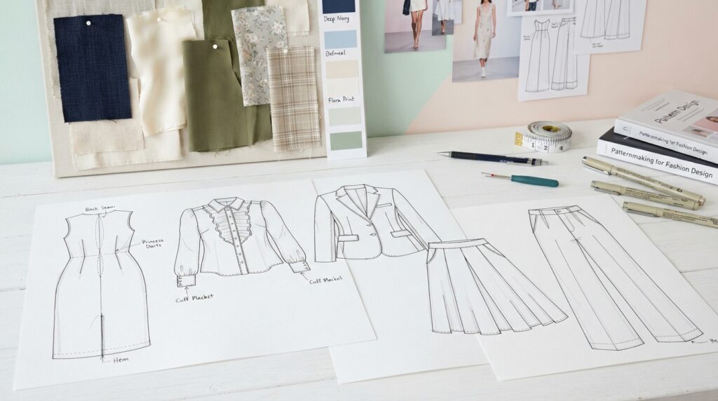
A technical flat is a two-dimensional, proportion-conscious garment drawing that shows construction more directly than an expressive figure illustration. It helps us communicate seams, pleats, fastenings, collars and pockets without a pose taking attention away from them.
Draw the garment silhouette first
Look for the garment’s main outline, including its shoulder, body, sleeve, hem and neckline. Then mark the major panels that change its shape. For example, a wide cuff or a flared hem affects the outline before we add small trim.
Add construction details and clean the drawing
- Establish the silhouette and major garment panels.
- Add construction or decorative details, such as seams and pockets.
- Remove lines that do not clarify the design.
A collar should have a clear edge, and a fastening should sit in a useful place. Pleats need marks that show where they begin, while seams should follow the garment’s panels. Keep decorative lines distinct from construction lines when both appear.
Check whether each mark helps explain the design. Keep a detail only when it helps someone understand the garment’s shape, function or finish.
How Do We Draw Folds and Fabric Drape?
Folds make more sense when we first locate where the fabric hangs, stretches or bunches against the body. Follow gravity from supported points, such as a shoulder seam, waistband or hand. Start at the support, then let the fold travel away from it.
Place folds where cloth is supported, pulled or gathered instead of scattering lines across the garment. A sleeve may hang from the shoulder, while a gathered waist pulls fabric toward a seam. Those forces help us decide where the fabric turns.
Follow the fabric’s fall
Use long lines when fabric drops over a large area, and shorter marks where it bunches. Folds can spread from a point of tension, such as a bent elbow or a belt. We can also leave parts of the garment smooth when nothing pulls the cloth there.
The way fabric falls can change a garment’s outline and volume. A fashion draping guide shows how weight, grain direction and fabric placement shape a garment on a dress form.
Use folds to suggest fabric weight
Silk can have longer, softer folds that flow across the body. Denim usually has firmer creases and less flowing volume. Quilting calls for broader compressed shapes that suggest padding between stitched sections.
Feathers, fur and sequins need marks beyond ordinary folds. Feathers can overlap in small groups, fur can use short directional strokes, and sequins can catch light in distinct spots. These marks help us show a surface without changing the garment’s main structure.
A shadow beside a fold can make the cloth look deeper than an outline alone. Place a shadow beside a fold rather than outlining every crease with an equally dark line.
How Can We Show Fabric Texture and Patterns?
Texture reads best when our marks follow the material instead of repeating the same stroke across every garment. Short, directional marks can suggest fur, while small clustered shapes can suggest feathers. Let the surface guide the mark so the texture supports the garment’s shape.
A print is easier to read when we control motif scale, spacing and color contrast. Quilting lines can divide a surface into stitched sections, while a few bright accents can suggest sequins. We do not need to cover every inch to make a surface clear.
Build surface texture with marks
Use short strokes that follow the direction of fur, rather than drawing a dark outline around every strand. Build feather shapes in small overlapping groups. For sequins, place selective bright accents against darker marks so a few surfaces appear reflective.
Suggest a print without drawing every motif
A floral print can use a few clear flowers, leaves or buds repeated across the garment. First choose the motif scale, then decide how much space sits between motifs. Set the color contrast so the print remains distinct from the garment base.
A tiny motif may disappear when we view the figure at page size. Larger motifs can change the look of a sleeve or bodice, while closer spacing can make a print feel denser. We can leave some areas plain if a full repeat would hide the silhouette.
Step back from the page and check whether the print still reads as a pattern rather than scattered decoration. Remove marks that make the print compete with a seam or garment edge.
How Do We Add Color, Shading and Highlights?
A clear color plan starts with broad garment shapes before we spend time on highlights or tiny accents. Markers, watercolor, gouache and colored pencils can all add color to an illustration. Color the large areas first, then use smaller marks to sharpen the design.
Plan three value groups: highlights, midtones and shadows. Colored pencils can add control to small details, while markers can cover larger areas quickly. We can also leave some paper uncolored to preserve light.
Lay in color from broad shapes to accents
Begin with the main colors on the garment, keeping each area inside its outline. Add smaller color changes only after the large shapes read clearly. A narrow color accent on a collar can draw the eye without taking over the outfit.
Control light, shadow and fabric effects
Midtones cover the main color areas, highlights show where light reaches the surface, and shadows clarify turns and overlaps. A narrow highlight can suggest shine on satin or a polished detail. Broader shadows can make a sleeve or skirt look rounded.
- Outline the figure.
- Dress the figure with the garment shape.
- Add garment details and drape.
- Render fabric, print and color.
- Refine shading and personal style.
Keep the light source consistent across the figure and clothing. When a sleeve’s shadow falls on the torso, nearby folds should follow the same light direction. Leave the lightest areas of a shiny fabric uncolored until the surrounding values are in place.
Which Digital Tools Can Support Fashion Sketching?
Choose an app by the task we need it to do, whether that is drawing a croquis, trying digital media or testing design features. Pret-a-Template suits croquis templates, while Tayasui Sketches offers digital tools that resemble familiar media. Match the tool to the task, rather than expecting one app to do everything.
For feature-rich sketching, Fashion Design Clothes: Sketch combines croquis drawing with a blank canvas and design features. Its Google Play listing showed a 4.6 rating from 11.6K reviews and an October 26, 2026 update date.
Pick an app for the task
| Tool | Stated use | Distinctive features |
|---|---|---|
| RePaper | Digital fashion drawing | Paper colors and textures; pencil, colored-pencil and fine-marker tools; 6B pencil option |
| Pret-a-Template | iPad drawing or printing with croquis | Different template sizes and styles; shoe, bag, pet and accessory templates |
| Tayasui Sketches | iPad drawing | Tools intended to resemble watercolor, pencils, markers and ink |
| Fashion Design Clothes: Sketch | Croquis drawing and design features | Blank canvas, AI sketch enhancement, AI virtual try-on and design competitions in 2026 |
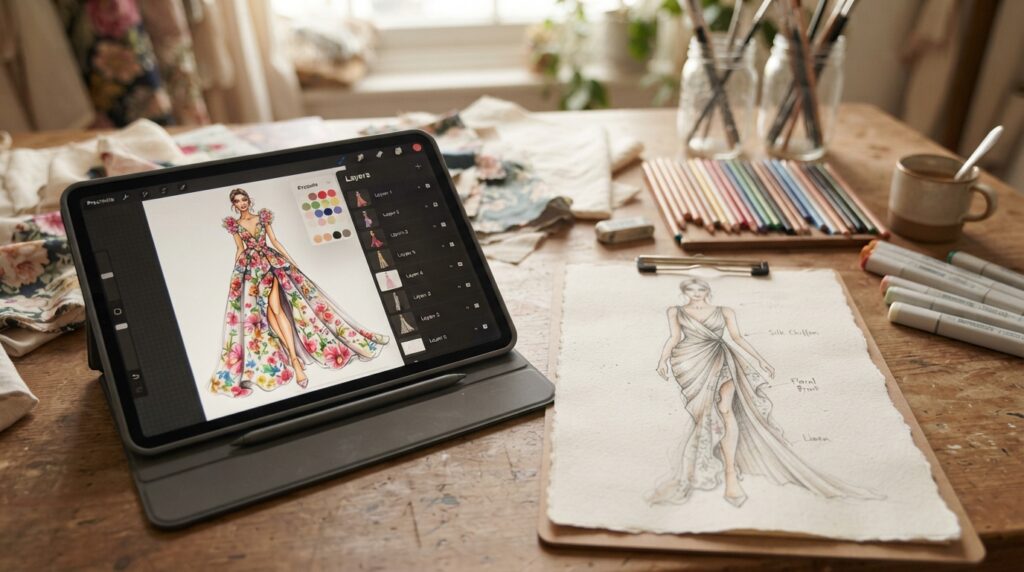
Pret-a-Template can help when we want croquis in different sizes and styles. Tayasui Sketches offers tools intended to echo watercolor, pencil, marker and ink. Fashion Design Clothes: Sketch includes AI sketch enhancement, AI virtual try-on and design competitions in 2026.
One user review of Fashion Design Clothes: Sketch reports limits on adding layers, saving progress, undoing some actions and adding photos. Those limits describe that reviewer’s experience, not every user’s experience. The listing’s rating does not guarantee that the app fits our workflow.
Use layers and digital features deliberately
Layers let us keep a figure, garment and color treatment separate while we test changes. A blank canvas can hold a new idea, and digital brushes can imitate some traditional marks. Procreate, Adobe Illustrator and CorelDRAW are other digital drawing or design tools.
We can duplicate a layer before changing a sleeve or shifting a print. That gives us a way to compare versions without redrawing the whole outfit. Save a duplicate or export a checkpoint before making a major change to a digital drawing.
How Do Fashion Sketches Differ From Technical Flats?
A fashion illustration sells the look and mood, while a technical flat makes garment construction easier to inspect. A rough sketch captures an early concept, while a figure illustration can show styling and fabric flow. Each drawing answers a different question about the design.
A flat is better for showing seams and garment components clearly. It uses a two-dimensional view with proportion-conscious shapes, so details do not depend on a model’s pose. A fashion figure can show how the garment moves and feels as part of an outfit.
For one design, we can draw an expressive figure to show the intended look, then make a flat to clarify construction. The figure might show a long coat in motion, while the flat makes its collar, closures and seams easier to inspect.
A rough sketch can stay loose because it records an early idea. A finished fashion illustration puts more attention on the look, styling and fabric movement. A technical flat makes garment parts easier to read without expressive styling.
We can use both views when a design needs mood and construction detail. Use the format that answers the viewer’s question instead of forcing one drawing to do both jobs.
How Can We Develop a Personal Style Through Practice?
A short, focused practice session is more useful than trying to perfect every skill in one sitting. Choose one task and repeat it long enough to notice what changes. Small exercises are easier to finish than a full collection of polished sketches.
Practice one skill at a time, then bring the strongest results into a class project or personal design. Repeating a pose or garment shape can help us spot where our lines, proportions or fabric marks need work.
Repeat short, focused drawing exercises
- Redraw a proportion guide to practice figure placement.
- Make quick gesture poses to practice balance and direction.
- Repeat one garment silhouette with small changes.
- Render one fabric surface using a few clear marks.
Use classes and books as structured practice
A course or book can organize practice from figure blocking through poses, textures and color. One beginner fashion illustration class sequence has 13 lessons totaling 1 hour and 41 minutes. It covers figure blocking, walking, standing and side poses, fabric textures and coloring.
In 2026, Coursera learners can preview the first module of many fashion design courses at no cost. Eligible Specializations or Coursera Plus access can also start with a 7-day free trial. A class can offer structure, but it does not promise skill or career results.
Pick a class project we can finish with materials already on hand. A single outfit drawing can give us a clear goal without turning practice into a shopping list. Keep one dated page of exercises so we can compare our own progress over time.
How Do We Check a Finished Illustration?
A finished drawing should still communicate its main silhouette when we look at it from normal viewing distance. Check it in three passes: silhouette and pose, garment details, then color and value. Readability comes first, even when the drawing has careful detail.
Keep the focal point clear at page size, not only when we inspect the drawing up close. First check whether the figure’s pose and garment outline make sense. Next, see if details help explain the garment or crowd its shape.
When folds, patterns and seams compete, simplify the busiest region until the garment’s main feature reads clearly.
In the final pass, check whether color and value keep the eye on the intended feature. A dark print, bright highlight or deep shadow can pull attention away from the garment’s main shape. Adjust the area that draws focus for the wrong reason.
Look at the full page, then move closer to check small details. Some lines that seem useful up close may vanish or merge at normal viewing distance. Remove one unnecessary mark wherever it competes with the garment’s clearest feature.
Conclusion
We can make a convincing first design sketch by prioritizing the figure’s balance and the garment’s clearest shape. A readable outline gives us a strong base, while selective details help explain the clothes without crowding them.
Our next step can be one short exercise with a single pose and outfit idea. We can keep the drawing loose and focus on the main silhouette instead of fixing every small line. Choose one outfit idea today, draw its silhouette on a simple figure and keep the page as the starting point for our next design.