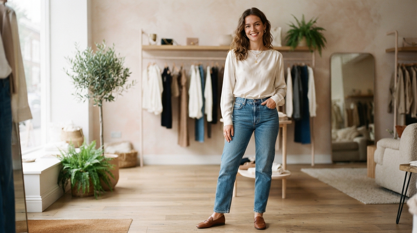
A polished outfit can start with one familiar piece and a single contrasting surface. A silk blouse beside denim, for example, can make everyday clothes feel more considered without changing the whole look.
Fashion Texture and Material Coordination helps us choose a base, add contrast, and keep an outfit cohesive. Visual weight means how visually substantial one surface appears compared with another. That difference can guide our choices as we dress, whether we want a quiet look or one with more visual interest.
Texture and material are practical styling choices, not a reason to buy new clothes. We can work with what we own, then decide whether a combination feels right for our personal style. The same approach can help with summer dressing, when fabric and finish both affect how clothing looks.
We can begin with clothes already in our closets and test one new combination at a time.
Key Takeaways
- Start with one familiar piece as the base.
- Use visual weight to judge how surfaces balance.
- Two or three textures can make a useful starting mix.
- A limited palette can help contrasting materials work together.
- Test combinations with clothes we already own.
How Does Fashion Texture and Material Coordination Shape an Outfit?
A satin surface and a raw-linen surface can make the same color appear noticeably different. Texture changes visual interest by shaping how much depth and contrast an outfit shows, even when its colors stay simple.
Surface contrast can make one piece stand out while quieter materials help the whole outfit feel balanced. We can use four practical categories: smooth, rough, structured, and flowing. Each gives clothing a different visual character.
Smooth, Rough, and Reflective Surfaces
Smooth surfaces include silk, jersey, and fine cotton. They reflect light evenly, so their appearance often feels calm and clean. Raw linen, flannel, and knits have rough or rippled surfaces that absorb more light and create shadows.
Satin, patent leather, and metallic materials amplify light, so they can serve as focal points. Structured materials hold a clear shape, as a crisp cotton shirt does. Flowing materials, such as a draped silk top, move easily around the body.
These categories can overlap. A knit may feel soft but look bulky, while a silk piece may flow and still have a smooth finish. To see how fabric shape affects an outfit, we can use these proportion and balance tips.
| Texture category | Examples | Light response | Visual effect |
|---|---|---|---|
| Smooth | Silk, jersey, fine cotton | Reflects light evenly | Clean, even appearance |
| Rough or rippled | Knits, raw linen, flannel | Absorbs more light | Shadows and visible depth |
| Shiny or reflective | Satin, patent leather, metallics | Amplifies light | Strong focal point |
Why Texture Adds Dimension to Monochromatic Looks
A monochromatic outfit can feel more dynamic when its pieces have different textures. A single color family gives the eye a steady thread, while changes in surface add dimension without adding more colors.
For example, a smooth top beside a nubby knit can make a one-color outfit feel less flat. We can also use a reflective accessory for a sharper point of focus. Different textures can add dimension to a monochromatic outfit without changing its color story.
Texture affects an outfit’s visual weight, so we should judge each surface as part of the full look.
To make one surface the focal point, place it where we want the eye to land and let quieter textures support it.
How Do We Balance Contrasting Textures and Outfit Proportions?
A bulky knit over sleek trousers gives the outfit a different balance than a heavy knit layered over another bulky piece. We can pair soft materials with firmer ones, then check how each item’s visual weight affects the whole outfit.
Two or three distinct textures usually create enough contrast without crowding an outfit. This is a styling rule of thumb, not a strict limit. A statement piece may already carry most of the visual interest, so adding more texture can be unnecessary.
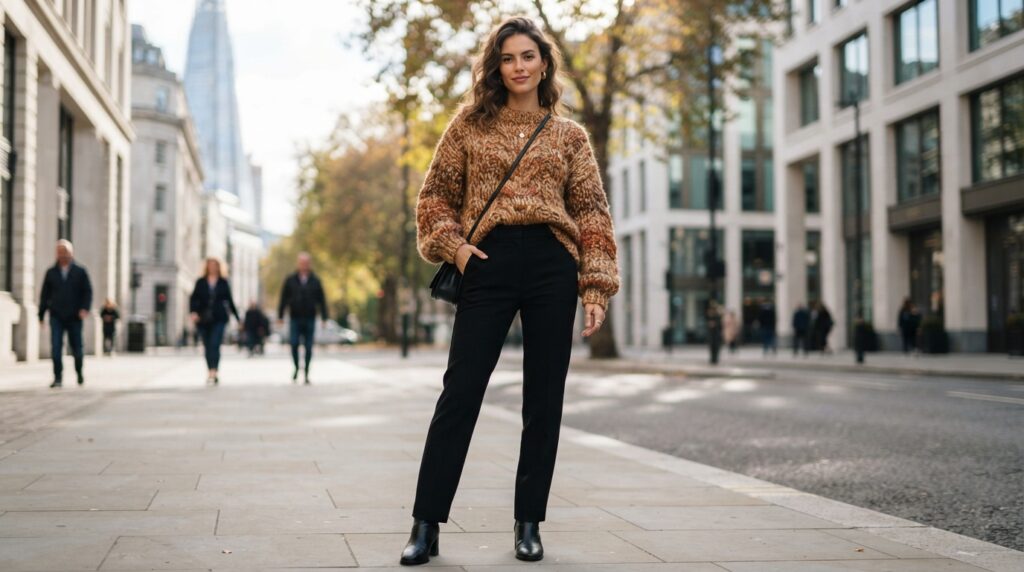
Pair Soft and Hard Materials
Soft materials can soften a firm or structured piece. A flowing layer beside a crisp garment creates contrast without making every part of the outfit feel equally strong.
We can test these combinations and notice what each one contributes:
- Denim with lace or silk pairs a sturdy surface with a delicate one.
- Leather with cashmere or knit sets a firm material against a soft layer.
- Tweed with chiffon mixes a dense, nubby surface with a light, fluid one.
- Suede with mesh or cotton poplin contrasts a soft finish with a crisp or open surface.
Keep Volume and Visual Weight in Balance
Clothing volume matters as much as texture. A roomy sweater can feel balanced with a slimmer or more fluid piece, while two bulky layers may compete for attention.
We can also use placement to guide the eye. A substantial surface near the shoulders may pair well with a simpler lower half, while a full skirt can take the lead with a quiet top.
The overall effect depends on how the garments sit together, not just their names. We can look at the outfit from a few steps away and see whether one piece dominates by size, surface, or detail.
Before adding another layer, check whether it changes the balance or only adds more visual weight.
How Can Color Keep Mixed Materials Cohesive?
A limited palette gives contrasting surfaces room to stand out without making an outfit feel scattered. A neutral or monochromatic base lets texture lead, while a small accent can bring focus.
Choose the colors first, then check them on the actual fabrics. Fabric color can look different across materials and lighting, so a shade on a screen may not match the piece in our hands.
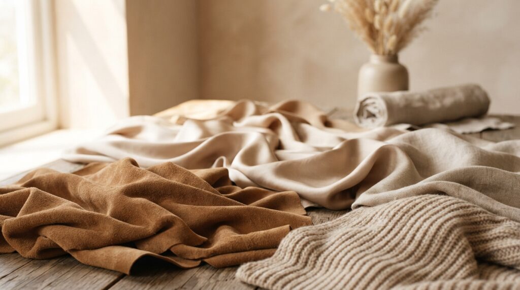
Choose a Palette Before Adding Contrast
A restrained summer outfit formula uses no more than two or three noticeable colors. Beige, camel, and deep brown create a monochromatic palette, while texture keeps the pieces from looking too alike.
We can choose a base shade, then add one companion or accent. If the materials already have strong surface detail, fewer colors can help the outfit feel more settled.
Use Color Relationships to Guide the Mix
The traditional color wheel has three primary colors, red, yellow, and blue, plus three secondary colors, green, orange, and purple. We can use those relationships as a simple guide, not a strict formula.
| Palette type | Color example | Relationship | Useful effect |
|---|---|---|---|
| Complementary | Blue and orange | Opposite on the color wheel | Clear, lively contrast |
| Analogous | Blue, blue-green, and green | Neighboring colors | Related, calm appearance |
| Monochromatic | Beige, camel, and deep brown | One color family | Cohesion with tonal depth |
Digital pictures may not show fabric colors exactly. A textile-image study improved visual fidelity by 21.2% through image capture and processing steps.
We can use this four-step check before getting dressed:
- Choose a base color.
- Select an accent or tonal companion.
- Check how the colors look on the actual fabrics.
- Remove a color if the outfit feels busy.
A warm-weather look works well with two or three noticeable colors, while texture supplies extra variation.
Which Fabrics Make Sense for Hot-Weather Outfits?
On a humid day, a dense cotton shirt may feel hotter than an airy linen blend. Fabric construction matters, so fiber names alone do not tell us how a garment will feel.
Check breathability, surface, and care before choosing a summer layer. Linen can feel airy and look visibly textured, while a linen blend may feel lighter or smoother depending on its weave and weight.
Compare Breathability and Surface
Linen is a useful choice when we want breathability and visible texture. Its uneven surface gives an outfit a relaxed look, but it creases quickly. Choose linen when texture matters more than a consistently smooth appearance.
An airy linen blend can suit warm days when we want a lighter feel. Dense cotton may feel warmer than that blend, even though both use natural fibers. The shirt’s construction changes how it wears.
Seersucker has a puckered surface that keeps some fabric off the skin. That texture can make it a useful warm-weather choice when we want a crisp shirt with a less flat finish.
Factor In Creasing and Care
Care can shape how often we reach for a garment. Linen creases quickly, so we may prefer it for relaxed outfits rather than a look that needs a smooth finish throughout the day.
Polyester garments can release microplastic fibers during washing. They are also not readily biodegradable under ordinary disposal conditions, but that fact does not mean every wearer will face a health effect.
A fabric’s feel depends on more than its fiber label. We can compare the surface, thickness, and drape of two shirts before choosing between them.
Check the fabric’s weave and weight as well as its fiber name before choosing a warm-weather layer.
How Can We Use a Statement Texture for Different Occasions?
A satin scarf against a matte outfit can add a focal point without requiring another layered garment. For daytime, one reflective or textured accessory can give simple clothes a clear point of interest.
Keep the rest of the outfit quiet when one statement texture takes the lead. A textured bag or shoe can bring impact to a plain top and trousers without making the full look feel busy.
Bring a Reflective Finish Into Focus
For an evening event, silk or satin can carry more of the outfit. A draped blouse or skirt can feel dressed up with simple tailoring and few extra details.
We can also choose a matte finish for most pieces, then let one accessory catch attention. This works well when we want a small change from our usual clothes rather than a full occasion outfit.
Adapt a Trend to Everyday Clothes
The 2026 spring/summer collections featured silk and satin in soft, draped tailoring and robe-like shapes. They also included statement skirts with texture and dramatic proportions, paired with simple tops.
We can treat those looks as inspiration, not a rule. A draped satin shirt with tailored pants or a textured skirt with a plain top can bring the idea into everyday wear.
A statement texture can suit a dinner, a daytime event, or an ordinary workday when the rest of the outfit fits the setting. We can adjust the amount of shine or surface detail to match how dressed up we want to feel.
Keep one statement texture in charge when the rest of the outfit already has dramatic volume.
Keep one statement texture in charge when the rest of the outfit already has dramatic volume.
Conclusion
A cohesive outfit does not need many competing surfaces to feel considered. A clear focal point and a restrained mix usually make coordination easier, while leaving room for personal style.
We can learn more from one small change than from replacing a whole outfit. Choose one outfit we already wear, swap one item for a contrasting texture, and keep the version that feels most like us.