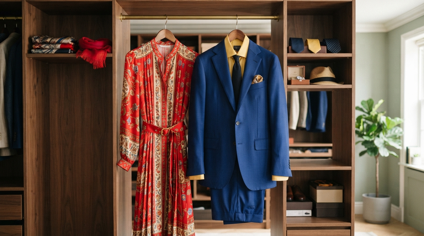
A familiar outfit dilemma is standing in front of a closet and wondering whether two colors will work together. Our choices can feel uncertain, even when both pieces look good alone. Simple color principles help us decide with more confidence while leaving room for personal taste.
Color is part of the art of getting dressed, but it also shapes how an outfit feels as a whole. A thoughtful color choice can bring separate pieces together, draw the eye, or give a familiar look a new sense of energy. The same approach can help us plan clothing for a collection.
We will use clear examples to build cohesive, expressive looks, then adjust them to suit our own experience and style. We can use color relationships as a guide, then keep the combinations that feel right to us.
Key Takeaways
- Use the color wheel to plan how hues relate.
- Describe colors by hue, saturation, and value.
- Try close, tonal, or high-contrast combinations.
- Treat seasonal palettes and trends as optional ideas.
- Check dyed fabric against a shared color standard.
How Color Theory in Fashion Design Uses the Color Wheel
We can use a color wheel as a map of how hues relate, beginning with the red, yellow, and blue RYB model. A color wheel is a circular diagram that arranges hues to show their relationships and help us plan color combinations.
RYB is a useful model for planning pigment-based color, while screens and printing use different systems. The color wheel is often attributed to Isaac Newton in 1706. In the 19th century, Michel Chevreul developed a wheel that included secondary and tertiary colors.
RYB primaries, secondary colors, and tertiary colors
In RYB color theory, red, yellow, and blue are primary colors. Mixing two primary colors produces a secondary color. Mixing a primary with a neighboring secondary color produces a tertiary color.
These groups help us name a hue’s place on the wheel. The same labels give designers a shared way to discuss color choices before choosing cloth or planning a full look.
- Primary colors: red, yellow, and blue.
- Secondary colors: orange, green, and purple.
- Tertiary colors: red-orange, yellow-orange, yellow-green, blue-green, blue-violet, and red-violet.
The RYB color model offers a familiar starting point for art and fashion design. It helps us map relationships, though it does not describe every way that colors can mix.
Before using a digital swatch to guide a garment, remember that RGB light on a screen and physical textile color are different systems.
Why digital and print use different color models
RYB describes colors made with pigments, such as paint. RGB combines red, green, and blue light, and those lights can produce white light together. Screens display color through light, so their color model differs from pigment mixing.
CMYK printing uses cyan, magenta, yellow, and key, or black. A print combines inks on a surface; a screen combines light. These systems can show similar colors, but they do not mix in the same way.
That difference matters when we move from a digital design to a printed sheet or garment. A screen can help us choose a direction, but it cannot show exactly how a physical textile will appear.
What Makes a Color Lighter, Darker, or More Muted?
A bright red and a pale pink can share a hue while differing in saturation and value. Hue names the base color; saturation describes its intensity or purity, while value describes its lightness or darkness.
We should name hue, saturation, and value separately when comparing colors. A vivid red has strong saturation, while a muted red looks less intense. A pale color has a higher, lighter value than a deep version of that hue.
https://www.youtube.com/watch?v=Rv-oMZebBEU
Hue, saturation, and value
These terms help us describe the difference between colors that might otherwise sound alike. Blue, for example, identifies a hue. A strong, vivid blue has higher saturation than a grayish blue.
Value describes how light or dark a color appears, not how vivid it is. A light blue and a deep blue can have similar saturation but different values. That distinction helps us choose outfits with either soft contrast or a stronger light-dark split.
When we talk about color theory, these three features give us a practical way to adjust a shade. We can keep the same hue and change its intensity or lightness to suit the look.
Tints, shades, tones, and muted colors
A tint adds white to a hue, while a shade adds black. Pink is a tint of red, and burgundy is a darker red shade. A tone adds gray, which lowers a hue’s intensity.
A muted color is made by adding a complementary color to a hue. That differs from adding gray: the complementary color alters the hue as it reduces its intensity. These small changes can affect how well two garments sit together.
The NCERT color theory guide explains hue, saturation, value, tints, tones, and shades. Its terms give us a clear way to discuss color without treating every version as interchangeable.
Compare both the hue and its lightness before deciding whether two garments will look balanced together.
Which Color Combinations Create Harmony or Contrast?
A monochromatic look is a simple place to start when we want cohesion without relying on a single flat shade. It uses multiple versions of one hue, such as a Peter Pan shirt with a sheer bubble-gum pink skirt.
We can build either harmony or contrast by choosing how hues relate on the wheel. Analogous colors sit beside one another, while complementary colors sit opposite. Equal amounts of highly saturated complementary colors can compete visually, so we can adjust their area or intensity.
Analogous colors create a smooth, unified look, such as red with orange or blue, green, and purple. Complementary colors create stronger contrast, as with red and green, orange and blue, or yellow and purple.
A triadic palette uses three hues spaced equally around the wheel, such as red, yellow, and blue. Split-complementary color pairs one hue with the two hues beside its complement, such as green with red-violet and red-orange.
| Scheme | Relationship on the wheel | Example colors | Styling effect |
|---|---|---|---|
| Monochromatic | Multiple shades of one hue | Tonal pink | Cohesive and dimensional |
| Analogous | Neighboring hues | Red and orange | Smooth and unified |
| Complementary | Opposite hues | Orange and blue | High contrast |
| Triadic | Three equally spaced hues | Red, yellow, and blue | Vivid balance |
| Split-complementary | A hue with the two neighbors of its complement | Green, red-violet, and red-orange | Contrast with more options than a direct complement |
For color theory in fashion design examples, we might choose the tonal pink look, a neighboring orange-red pairing, or a blue-orange contrast. Each gives an outfit a different level of separation between its pieces.
Achromatic outfits use black, white, and gray without hue. A warm-and-cool scheme groups hues by their warm or cool impression. Bright or contrasting areas can draw the eye, while darker colors tend to recede; color placement and visual emphasis can change how an outfit reads.
For a bold complementary outfit, let one hue lead and use its opposite in a smaller area.
How Do We Choose Colors for an Outfit and a Color Season?
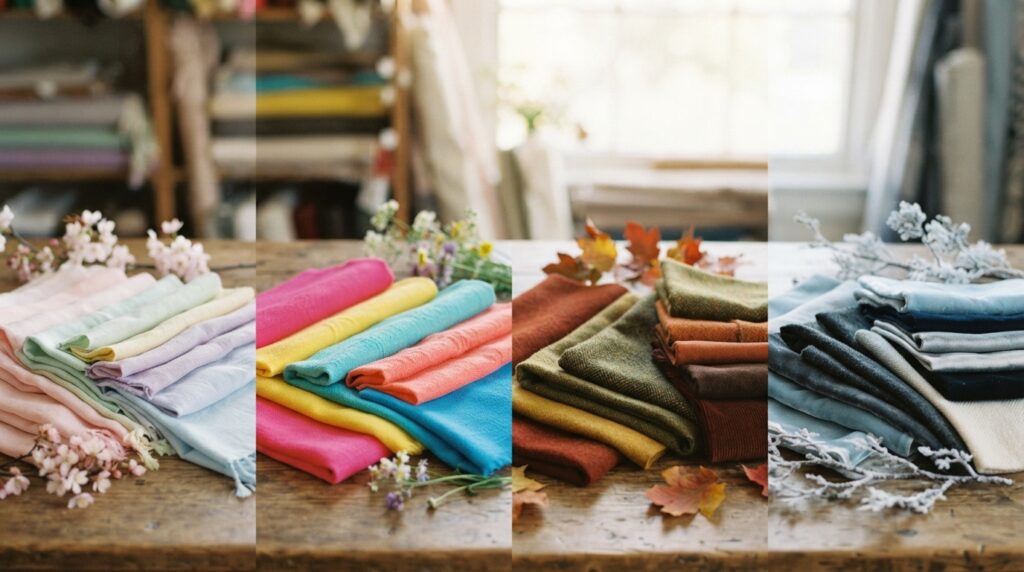
Seasonal color analysis is a way to narrow a large wardrobe palette, not a rule that limits what we can wear. The four broad seasons suggest color groups based on warmth, coolness, brightness, and depth.
Personal preference and the actual shade still matter when applying color theory for clothing. A season can offer a starting point, but no category can decide whether we enjoy wearing a particular color.
What the four color seasons suggest
Winter palettes are cool and bright. Pure white, black, and jewel tones are common examples. Spring palettes are warm and bright, with cream, salmon pink, and periwinkle as possible choices.
Summer palettes are cool and muted. Mauve, ashy brown, and stormy blue fit that broad group. Autumn palettes are warm and deeper or more saturated, with off-white, espresso, teal, lime, mustard, and plum.
These labels describe broad patterns, not a checklist we must follow. A blue shirt can vary in warmth, brightness, and depth, so its season depends on the shade rather than the name alone.
How undertones and contrast shape a palette
Warm undertones often appear golden or olive. Cool undertones can appear pink, red, or bluish. Those clues may help us decide whether a color looks balanced beside our skin.
We can compare a naturally lit photograph in color and black and white to assess facial contrast. In black and white, differences between light and dark features become easier to see without hue competing for attention.
This check can guide our color choices, but it is not a final verdict. Lighting, makeup, hair color, and the exact clothing shade can all change the impression.
When a 12-season tool can add nuance
Dressika offers AI-powered photo analysis based on 12 seasons. Its labels are Light Spring, Warm Spring, Bright Spring, Light Summer, Cool Summer, Soft Summer, Warm Autumn, Soft Autumn, Deep Autumn, Cool Winter, Bright Winter, and Deep Winter.
The app lists clothing palettes with 120 colors, makeup selection with 170 shades, and hair-color selection with 180 colors. Those options can give us more detail than four broad groups, though an app result remains a tool rather than a definitive diagnosis.
We can use a suggested palette to test colors near our face, then judge the actual shade in ordinary light. Keep a color in the rotation if we enjoy wearing it, even when a seasonal chart places it outside our suggested palette.
What Do Colors Communicate Across People and Cultures?
A color can communicate a mood, but the message people read into it is shaped by context. Color associations can help us set a design intention, yet culture and personal experience can change what a shade means.
Color psychology offers clues, not a universal response. In a 2026 consumer-perception study, participants linked blue with trust and competence, red with excitement and energy, and green with health and environmental responsibility.
| Color or group | Reported association | Share of respondents |
|---|---|---|
| Blue | Trust; competence | 74%; 68% |
| Red | Excitement; energy | 71%; 76% |
| Green | Health; environmental responsibility | 82%; 88% |
| Asian respondents | White with mourning | 64% |
| Western respondents | White with purity | 78% |
The white comparisons came from 285 respondents. Among them, 64% of Asian respondents associated white with mourning, while 78% of Western respondents associated it with purity.
Those differences show why a design team should consider its audience and setting. The same white outfit may carry distinct meanings for people with different cultural backgrounds or personal histories.
Color choices can also affect attention and buying interest. Unexpected colors received 43% more visual attention, yet their purchase-intention scores were 28% lower than colors that fit product-category conventions.
The purchase effect changed with brand position. Unconventional colors raised purchase intent by 18% for brands positioned as innovative disruptors, but lowered it by 24% for brands positioned as reliable market leaders.
These results can help designers form a testable idea about a garment or collection. They do not predict how every person will respond, and a brand’s image can change the effect.
Treat color psychology as a testable design hypothesis, not a promise about how every customer will feel.
How Do Fashion Color Trends Shape a Collection?
A forecast is most useful when it gives a collection a fresh starting point without replacing its design intent. The Pantone Color Institute published its New York Fashion Week Spring/Summer 2027 Fashion Color Trend Report on September 10, 2026.
The report names 10 standout colors and five seasonless shades. Its mix of natural-looking hues and bright, expressive colors encourages individual expression and experimentation.
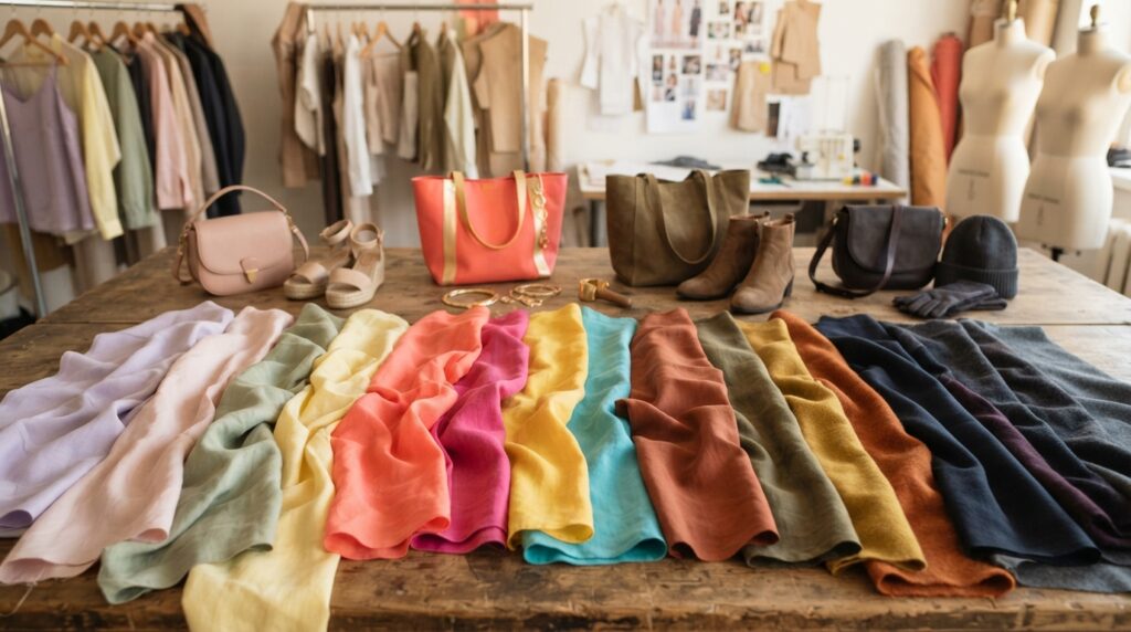
What the Spring/Summer 2027 forecast contains
The named shades can help designers set a first palette direction. They do not need to appear together, and a collection can use only the colors that suit its own story.
- Standout colors, group one: Anise Flower, Princess Blue, Waterfall, Langoustino, and Chili Pepper.
- Standout colors, group two: Rosy Future, Dragon Fire, Daiquiri Green, Hibiscus, and Lavender Oil.
- Seasonless shades: Antique White, Tarragon, Arrowwood, Blue Indigo, and Dolphin.
The report pairs natural-looking colors with more expressive choices. A designer might draw from both, or focus on one mood to keep the collection coherent.
How fashion history can inform, not dictate, a palette
Fashion history shows how color choices shift over time. Rich colors and beading marked 1920s Art Deco fashion, while Yves Saint Laurent used bold solid colors in the 1960s.
Saint Laurent lived from 1936 to 2008 and founded his label in 1961. Neon became a strong visual feature in the 1980s, followed by minimalism and neutrals in the 1990s.
These moments can help us think about how a palette connects to a period or mood. They are references, not rules that require a designer to repeat the past.
A forecast is a prompt for a palette, not a requirement to copy every shade. Designers can compare trend colors with the collection’s intended garments and audience before making choices.
Select only the trend colors that strengthen the collection’s story and can work across its intended garments.
How Do We Match a Palette to Fabric in Production?
A screen image alone is not a reliable color reference when a supplier needs to dye fabric. Shared standards give designers and suppliers a clear target, since screens can display colors differently.
We should agree on a color standard before requesting dyed samples. Designers and suppliers may use the same Pantone guide or another shared standard to describe the intended color.
Set a shared color standard
Pantone Fashion, Home + Interiors guides come as cotton fabric swatches or paper references. The fabric swatches use the TCX label, while paper versions use TPG and TPX.
A fabric swatch guide gives us a cloth reference, while a paper guide gives us a printed one. Pantone recommends replacing color guides every year, which helps teams work from a current standard.
We can record the chosen standard in the design details shared with the supplier. This makes the target easier to discuss than a screen image alone.
Review lab dips on the intended fabric
A lab dip is a fabric sample dyed to match a chosen standard. The process can take around two weeks, and the sample lets us judge color on cloth before bulk production.
We can review lab dips under controlled lighting with a light box or spectrophotometer, or in midday natural sunlight. The fabric affects how a color appears, so the sample should use the material planned for the garment.
Production checks can make color approval more orderly. We can keep the reference, material, and approval together so the team knows which sample set the final decision.
- Confirm the shared color standard with the supplier.
- Specify the color reference for each garment.
- Request a lab dip for the chosen shade.
- Assess the sample on the intended fabric.
- Approve the sample before bulk production.
A fabric can change a shade’s appearance through its surface and the way it reflects light. That makes the intended material part of the color decision, not just a later construction choice.
Approve the lab dip against the agreed standard on the actual fabric before authorizing bulk production.
How Can Designers Build and Test a Collection Palette?
A collection palette works best when its core colors express the brand before seasonal accents are added. A clear core supports consistent, expressive choices across the collection.
Suggested color counts and proportions are starting points, not fixed rules. Designers can adjust them to fit the garments, intended customer, and story they want the collection to tell.
Set a core palette before adding seasonal color
A suggested core palette uses one or two main brand colors, two or three supporting neutrals, and one accent. This gives a designer enough range without asking every color to do the same job.
For the collection range, a suggested mix is 60-70% core colors, 20-30% seasonal colors, and about 10% statement colors. These proportions can shift when a design needs more calm or more impact.
Natural textile dyes include indigo, madder, and cochineal. Their natural origin does not by itself prove that a dye has a lower environmental impact.
Test color choices against the collection and customer
We can test whether a color palette works by checking its mood, materials, and use across the planned garments. A small early review helps us see where the colors work and where they need adjustment.
- Define the brand’s intended mood.
- Select the core colors for the collection.
- Add a limited seasonal accent.
- Check fabric availability and color behavior.
- Review small-scale results and refine the palette.
This process helps a designer keep a steady color language while making room for new ideas. It also helps us see whether the shades suit the clothes and the people expected to wear them.
Keep the palette focused enough that its colors can be repeated consistently across the collection.
Small-scale results can reveal where a shade works best, such as across a set of garments or only as an accent. We can make that call before adding more colors to the range.
Keep the final palette focused enough that its colors can be repeated consistently across the collection.
Conclusion
Strong color choices come from combining a few clear principles with our own point of view. We can start with one relationship between hues, then change its intensity or the space each color takes up.
For outfits and fashion design, our personal taste is the final check. A color plan can guide us, but wearing or seeing the pieces together tells us whether the result feels right.
Choose three pieces or swatches, lay them together in daylight, and keep the combination that feels most like us.