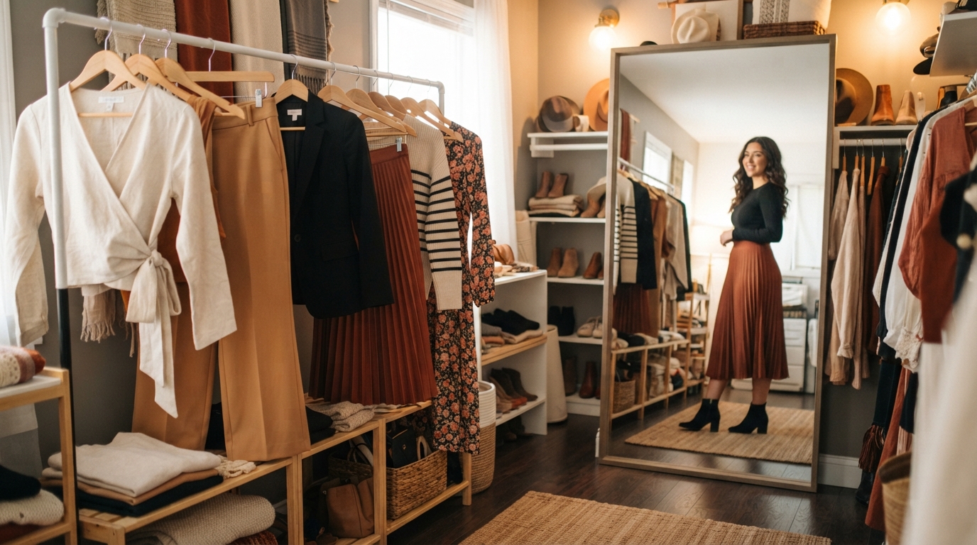
Two outfits can use similar clothes and still create very different impressions when their lengths, shapes, and visual emphasis change. Fashion proportion and balance give us practical ways to understand why those looks feel different.
We may pull on a familiar outfit and find that something feels unexpectedly awkward. The clothes still fit, and each piece may look good on its own. Yet the full look can seem unfinished or out of sync.
Small styling choices can change that feeling without replacing our clothes. We can adjust a hem, tuck a shirt, change a layer, or shift which detail stands out. Those changes can affect how a body and outfit read together, but they do not make any body a problem.
In the sections ahead, we will use simple design ideas to make those choices with more purpose. We can test different lengths, shapes, colors, and details with clothes we already own. The aim is not to make every outfit follow one formula. We can use these design choices to make getting dressed feel more deliberate without treating any proportion as a flaw.
Key Takeaways
- Proportion compares outfit parts; balance considers how visual weight is spread.
- A silhouette is the full outline we see from a distance.
- Lines, fabric, color, and detail scale all affect how clothes read.
- Color relationships can guide attention, but fabric and light change the result.
- Ratios offer starting points, not rules every outfit must follow.
- Changing one detail at a time helps us see what works.
What Does Fashion Proportion and Balance Mean?
Proportion tells us how parts relate, while balance tells us how visual weight is distributed across a design. Visual weight is the apparent heaviness or prominence an element creates in an outfit, whether through its size, color, texture, or detail. Proportion compares parts, and balance considers their combined visual impact.
For example, a tucked top with high-rise trousers changes the visible relationship between the upper and lower parts of an outfit. An oversized sleeve can also feel more considered beside a fitted waist. These fashion proportion and balance examples show how changing one part can affect the whole.
Proportion compares parts; balance distributes visual weight
Proportion can describe the size of a pocket beside a coat, or the length of a jacket beside a skirt. Balance asks whether those parts feel visually steady together. A small bright detail can draw the eye as strongly as a larger, quieter area.
Designers have also used mathematical ratios as references. The traditional golden ratio is about 1.618, and ratios between adjacent Fibonacci numbers approach it. That ratio is a historical design reference, not a required outfit formula.
We can test ratios as design tools, but no outfit needs to obey one fixed measurement.
The Museum at FIT describes core elements and principles of fashion design, including proportion, balance, line, color, texture, emphasis, and rhythm. These ideas work together rather than acting as separate rules.
How the elements work together
Shape and silhouette give an outfit its outline, while line guides attention across that shape. Texture adds surface interest, and color can change which areas stand out. Emphasis gives the eye a place to land, while rhythm helps it move through repeated details.
For instance, a plain skirt and a patterned top may create a clear point of interest. Repeating one color in a shoe or bag can then connect the pieces. The result depends on how each part supports the others, not on one design principle alone.
We can examine these elements in a mirror or in a photograph. A picture can make a strong color or oversized detail easier to notice. We can treat ratios as tools for testing a look, not as measurements every outfit must obey.
How Does Visual Balance Work in an Outfit?
A pair of matching details can feel orderly, while two different details can still feel balanced if their visual impact is in equilibrium. Both approaches work when the weight of each part supports the full design. Balance does not require a mirror-image outfit.
Symmetrical balance uses matching elements on either side of a design. Asymmetrical balance uses different elements that reach a similar sense of visual steadiness. A jacket with matching pockets uses the first approach, while a jacket with one bold pocket and a smaller detail elsewhere may use the second.
| Design feature | Symmetrical balance | Asymmetrical balance |
|---|---|---|
| Elements | Matching pockets or sleeves repeat on both sides. | Different details sit on each side of the design. |
| Visual weight | Similar size and placement create an even distribution. | Different sizes or colors balance through their impact. |
| Example | A coat has two equal pockets at the same height. | A large pocket balances a smaller, darker detail. |
The table shows that balance can come from matching parts or from thoughtful differences. A pair of sleeves may look even because they match in length and shape. A bold trim on one side can also feel steady beside a darker or larger detail elsewhere.
We can look at the details in relation to the entire outfit. A bright scarf may balance a large bag, even when the items do not match. Their size, color, and placement affect how much attention each one receives.
Symmetry often gives a design a calm, ordered feel. Asymmetry can make it seem more active or relaxed. Neither approach is automatically better, and either method can feel intentional when we consider its visual weight.
We can check balance by considering the whole design rather than demanding that every side match.
How Does Silhouette Shape an Outfit?
From across a room, an outfit reads first as an outline, before its small details become clear. That outline is the silhouette: the overall shape of the clothing as it appears from a distance. The full outline matters before we focus on trims or stitching.
Length, width, and volume work together to form a silhouette. A long, narrow coat creates a different shape from a short, wide jacket. The right choice relates to the body structure and to the other pieces in the outfit.
We can compare a distant view with a close one. From far away, we notice where the outfit widens, narrows, or ends. Up close, we see seams, buttons, and surface details that do not define the outline on their own.
A well-made dress may still feel out of proportion beside a bulky coat or a cropped jacket. The dress has its own shape, but the extra layer changes the full outline. Separates can create the same effect: a wide top and long, full skirt may combine into more volume than either piece suggests alone.
We can study how to read a garment’s outline by stepping back and noticing where it adds or releases volume. The outline may shift as we move, so a seated view can also help when we plan to wear the outfit for a long time.
Our view does not need to match a single ideal shape. The goal is to see how the pieces meet and whether the outline suits the way we want to wear them. We can step back from a mirror and assess the whole outline before deciding which individual piece needs adjustment.
Which Lines Change a Garment’s Visual Effect?
A seam, opening, or pleat can guide the eye before we notice a garment’s color or fabric. Lines shape what we notice by creating direction and visual interest. Line placement affects which area draws attention.
Construction and surface details both make lines. Seams can run down a sleeve, while openings create edges at the front of a shirt. Pleats, gathers, tucks, topstitching, and trims add further paths for the eye to follow.
Lines made by construction and detail
Straight lines often suggest a crisp, firm effect. Curved lines can feel softer and more fluid. A curved seam can change how a garment’s shape reads, even when the fabric and color stay the same.
We can notice the lines on a shirt without treating each seam as a separate feature. A row of buttons, an open collar, and a tucked front may form one path. The eye often follows these details as a group.
What vertical, horizontal, and diagonal lines do
Three common line directions can affect how a shape reads:
- Vertical lines can add a sense of length.
- Horizontal lines can make an area appear wider.
- Diagonal lines can suggest energy or movement.
The effect depends on where a line appears and how strong it looks. A narrow vertical seam may be subtle, while a bright diagonal stripe may command more interest. A row of horizontal details near a hem can make that edge stand out.
We can test line direction by changing one garment or detail at a time. For example, an open shirt creates long edges down the front, while a closed shirt forms a clearer band across the torso. We can use the direction of a line deliberately, while remembering that its placement determines which area catches the eye.
How Do Texture and Scale Change an Outfit?
A chunky knit and glossy satin create a clear contrast because their surfaces look and feel different. Texture adds surface interest through the fabric’s weave and its appearance or touch. A fabric’s texture can change how a shape feels, even when its cut stays the same.
Some fabrics feel stiff and hold a shape, while fluid fabrics drape close to the body or move with it. That difference affects the outfit’s outline. A firm cotton jacket can keep a sharp edge, while a soft blouse may fall in gentle folds.
Texture comes from the fabric surface
We can see texture in a ribbed knit, smooth satin, or nubby tweed. We can also feel it by touch. The weave and finish both shape the surface, so two fabrics in the same color can still look quite different.
A chunky knit paired with glossy satin gives us a clear textural contrast. The knit looks soft and substantial, while the satin reflects light across a smoother surface. Together, they make each fabric easier to notice.
Scale details to the garment and wearer
Scale describes how large details look beside the wearer and the clothing. A small necklace can disappear against a bold collar, while a large bag can dominate a simple outfit. Jewelry, bags, buttons, and other details all add visual weight.
Delicate jewelry can suit a petite frame, while bolder pieces can work well on larger frames. These are options, not limits. A large earring may suit a smaller frame when the rest of the outfit leaves room for it.
We can also compare a garment’s details with its overall size. Tiny buttons may look lost on a wide coat, while very large buttons can compete with an intricate pattern. The clothing itself gives us useful context for judging accessory scale.
We can judge detail scale beside the full outfit, not by looking at an accessory or embellishment in isolation.
How Can Color Create Balance?
A color’s name alone cannot tell us how bright, light, or muted it will look in an outfit. Hue, value, and intensity describe those parts of color. We can read a shade more clearly by considering all three dimensions.
Hue is the color name, such as blue or yellow. Value tells us how light or dark it is, and intensity tells us how bright or dull it appears. A pale blue and a deep blue share a hue but differ in value.
Read hue, value, and intensity
A traditional color wheel groups colors as primary, secondary, and tertiary. Complementary colors sit opposite each other on the wheel, while analogous colors sit beside each other. These relationships give us starting points for pairing shades.
A triadic palette uses three colors spaced around the wheel. One shade can take the lead, while the other two appear as smaller accents. A tetradic palette uses four colors arranged as two complementary pairs, with one dominant shade and the others used selectively.
Account for fabric, light, and saturation
Color also changes with its surroundings. A bright shade beside a muted one may look even stronger. Indoor lighting, daylight, fabric finish, and saturation can all affect how a color reads.
| Palette | Color relationship | Practical use |
|---|---|---|
| Monochromatic | One hue appears in different values or intensities. | Use several shades of blue for a connected look. |
| Complementary | Two hues sit opposite each other on the wheel. | Let one shade lead and use the other as an accent. |
| Analogous | Two or more hues sit next to each other. | Combine blue, blue-green, and green for a close color group. |
| Triadic | Three hues sit at roughly equal points on the wheel. | Choose one dominant color and use two smaller accents. |
| Tetradic | Four hues form two complementary pairs. | Choose one dominant shade and add the others selectively. |
We can use these relationships to test a palette, not to limit what we wear. A vivid red may look softer in a matte fabric than in a shiny one. The same color may also shift beside a pale or dark neighbor.
We can test a palette in the actual fabric and lighting where we expect to wear it.
Where Can We Place a Focal Point?
A bold bow can become the first thing we notice when the rest of a dress is comparatively simple. That bow creates a focal point, or a clear place for the eye to land. One main point of interest can help an outfit feel easier to read.
Color accents, shapes, converging lines, grouped details, and contrast can all draw attention. An oversized bow is a noticeable shape because its size sets it apart from the rest of the dress. A focal point works best when nearby details do not compete with it.
Build a clear focal point
We can create a focal point in several ways:
- Add a color accent that stands apart from nearby shades.
- Choose a significant shape or detail, such as an oversized bow.
- Use lines that meet or point toward one area.
- Group small details so they read as one feature.
- Place contrast where we want the eye to pause.
The strongest choice depends on the rest of the outfit. A large brooch may stand out on a plain coat, while the same brooch may disappear beside a busy print. We can consider the detail’s size, color, and setting together.
Use repetition to lead the eye
Repetition can guide attention beyond one focal point. A color repeated in a scarf, shoe, or bag creates a link between separate parts. Repeating a pattern in two places can do the same thing.
Rhythm forms when details repeat in a way that leads the eye through a design. The repetition does not need to be exact. A small color accent in a shoe can echo a larger color in a jacket.
We can keep the focal detail noticeable without asking every piece to compete. Too many strong accents can scatter attention across the outfit. We can repeat a small color or pattern detail to guide the eye beyond the focal point.
How Can We Use the Rule of Thirds in an Outfit?
A top that ends at the natural waist can create a roughly 1/3-top, 2/3-bottom division. This outfit ratio is a useful starting point, not a rule for every look. The natural waist sits roughly level with the belly button, but that is only a practical guide.
Fashion proportion and balance examples include a top ending at the natural waist or a tucked top with a longer skirt or trousers. These choices make the top appear shorter beside the bottom. The visible division can change with the garment’s length and the way we wear it.
Set the top-to-bottom ratio
A tucked shirt or sweater creates a waist-length top, even when the garment would otherwise cover the hips. A shorter jacket can also end near the natural waist. Longer skirts or trousers then create more length below that point.
The ratio describes what we see, not the body’s exact measurements. A belt, color change, or hem can shift where the eye reads the division. We can use the idea to test how one length affects the whole outfit.
Solve length and coverage issues
A top may feel too long when it covers the waistband or bunches under a jacket. We can adjust the outfit in several ways:
- Tuck a tee or sweater into the waistband to create a waist-length top.
- Layer a long tank under a shorter cardigan or jacket for hip coverage.
- Match the tank to the pants to create an uninterrupted color line.
A tank under a shorter layer can add coverage without changing the jacket’s shape. Matching the tank to the pants can make the base layer read as one color area. We can leave the layer open so both pieces remain visible.
Different clothing cuts and personal preferences can change where a top feels best. We do not need to force the same division on every skirt, pair of trousers, or dress. We can keep the useful ratio in mind while choosing lengths that feel comfortable for the wearer.
How Can Long Layers Preserve a Balanced Line?
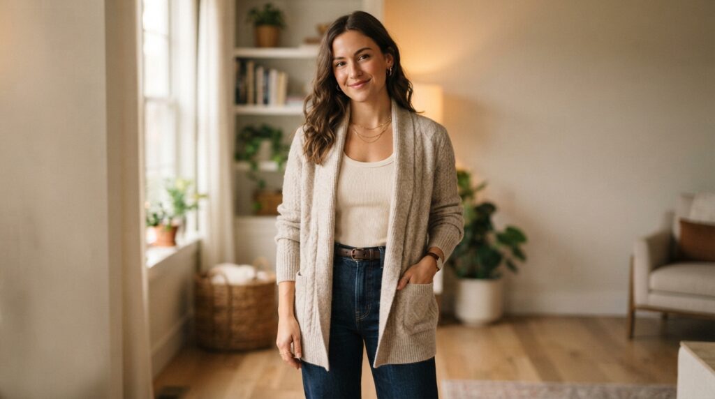
An open cardigan can frame the outfit while leaving the balanced proportions of the base layers visible. The open front lets the eye see through to the clothes underneath. A long layer can preserve the base outfit’s visible ratio when it stays open.
A duster or open cardigan falls along the sides of the body and frames the center. If the base layers show a 1:2 ratio, that division can remain visible beneath the longer layer. The outer garment adds length without hiding the full center line.
Keep the base line continuous
Wearing one color or shade from head to toe can reduce strong contrast between the top and bottom. The shared color creates an unbroken vertical line through the outfit. A change in fabric or shape can still add interest without a sharp color break.
We can use a similar shade across a shirt, pants, and outer layer. The fabrics may vary, but the color connection keeps the full look visually joined. This can help when a long layer might otherwise feel separate from the clothes beneath it.
Use hem and cuff breaks deliberately
A straight jacket edge can form a strong horizontal break at the widest part of the hips. An angled jacket front or a shirttail hem offers a softer alternative. These hems do not create the same level, straight line across the body.
Cropped pants or rolled cuffs can reveal the ankle, while a sleeve pushed back can show the wrist. Those small openings can help control the feel of a long or heavy outfit. They also make the garment edges easier to notice.
Leaving the last two buttons of a shirt undone can add movement at the lower edge. The opening creates two short shirt tails rather than one closed front. We can adjust a hem or cuff to reveal a little wrist or ankle when the long layer feels too heavy.
How Can We Adjust Proportions for Different Body Features?
For broad shoulders, a V-neck or scoop neck can draw the eye down while a fuller skirt or wide-leg trouser adds visual weight below. These are options for changing the way the outfit’s parts read, not fixes for a body flaw. We can choose an adjustment based on the effect we want.
Neckline depth, waist placement, and hem position can change where attention falls. A short torso may call for a different rise or top length than a long torso. A boot or hem at the calf’s widest point can also create a stop in the leg line.
| Feature | Visual effect to consider | Styling option | Choice to reconsider |
|---|---|---|---|
| Broad shoulders | A wide neckline or strong shoulder detail may draw attention up. | Try V-, scoop, or deeper U-necks with an A-line skirt, wide-leg trousers, or full midi skirt. | Skip shoulder details only if they create more emphasis than we want. |
| Short torso | A strong break at the waist can make the torso look shorter. | Try high-rise bottoms with a crop top that shows only a small amount of midriff. | Reconsider a top that ends at a strong horizontal line across the torso. |
| Calves or lower-leg line | A boot or hem at the calf’s widest point creates a visual stop. | Try knee-high boots or a hem below the fullest part of the calf. | Reconsider ankle straps that interrupt the leg line. |
For broad shoulders, a V-neck, scoop neck, or deeper U-neck can draw the eye down through the chest. An A-line skirt, wide-leg trousers, or full midi skirt can add visual weight below. These options change the outfit’s emphasis without requiring us to hide the shoulders.
For a short torso, a high-waisted bottom and a crop top showing only a small amount of midriff can avoid a strong horizontal break. For a short waist, one option places high-rise bottoms 1-2 inches above the natural waist. That placement is a choice, not a required landmark.
A boot or hem ending at the calf’s widest part creates a visual stop at that point. Knee-high boots or a hem below the fullest part of the calf continue the line. An ankle strap can interrupt that line by creating another edge near the foot.
We can choose the adjustment that matches the feature we want to emphasize or balance, rather than applying every option at once.
How Do We Balance Volume and Structure?
An oversized top can feel more intentional when straighter or more structured trousers give the lower half a firmer outline. That firmer shape gives the eye a clear edge to read. Volume can look deliberate when another part of the outfit gives it structure.
Wide or fluid trousers can pair with a shaped top or a firmer knit. A tailored jacket, blazer, or coat can also anchor softer pieces. These pairings make the outfit’s shape easier to see without removing all its movement.
Pair volume across top and bottom
We can compare the volume in the upper and lower parts of an outfit. An oversized top beside straight trousers creates a different shape from fluid trousers beneath a close-fitting top. Either choice can work when the full outline feels purposeful.
An exaggerated sleeve beside a more fitted waist is another way to balance differences in scale. The sleeve can remain the most noticeable part, while the waist gives the middle of the outfit a clearer shape. We do not have to remove the dramatic detail.
Anchor soft pieces with structure
Structure can come from a firm knit, a tailored jacket, a blazer, or a coat. A structured layer can hold its edges beside soft fabric that drapes. It can also give a loose shirt or dress a more defined frame.
We can choose structure in one piece, or use firm garments at both ends of the outfit. A tailored coat over a flowing dress creates a different effect from a soft wrap over that dress. The right choice depends on how much shape we want to keep visible.
A uniform amount of volume is not always a problem. Some outfits use wide shapes from shoulder to hem, while others rely on contrast. We can retain a dramatic piece by giving the rest of the outfit enough structure to support its shape.
What Should We Check When an Outfit Feels Off?
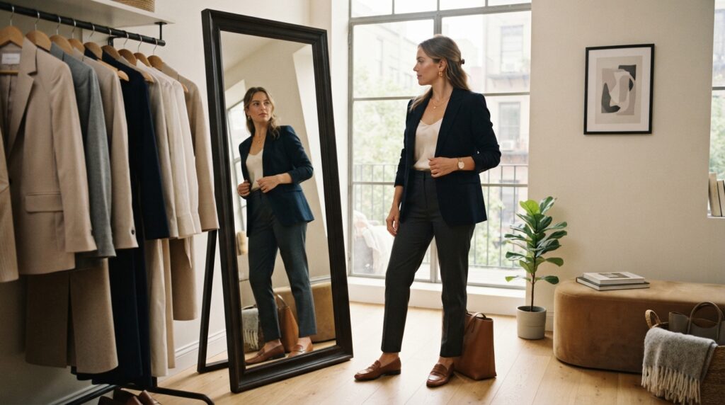
Before replacing an outfit that feels wrong, step back and identify where its lengths divide the body. One clear check can point us toward a small change. We can adjust one feature at a time to see what changes the look.
Begin with the outfit’s visible breaks, then look at where its visual weight sits and whether its pieces have enough structure. A jacket that ends at an awkward point may need a different layer. A loose combination may need a firmer edge.
Use these three checks to find a first adjustment:
- Where do the outfit’s lengths divide the body? Try adjusting one length.
- Where does visual weight sit? Try moving or reducing a strong detail.
- Do the pieces provide enough structure? Try adding a firmer layer.
We can make one small change, then look again to see whether the outfit feels more intentional.
Changing one thing at a time makes the effect easier to judge. We can tuck a shirt, change a jacket, or remove one bulky layer, then check the outfit again. If we change several things at once, it becomes harder to tell which one helped.
We can also take a quick picture from a few steps away. A photo may show a color block or hem that feels different from what we notice up close. The mirror and the photo give us two useful views of the same outfit.
Conclusion
We do not need to follow every styling guideline to make an outfit feel considered. Proportion and balance are tools we can adjust, not fixed standards for a body or a wardrobe. No single ratio or silhouette works for every outfit.
A small change in length, structure, or volume can make a design feel more deliberate. We can begin with clothes we already own instead of searching for a new set of rules. One useful test is enough to show whether an outfit feels closer to our style.
Choose a familiar outfit from the closet and change one thing, such as a hem, a firm layer, or a bulky piece. We can try one adjustment in a familiar outfit and keep the version that feels most like our own style.